GIT 210 Final Project Taxi Cab Redesign.

Idea Concept


            I elected to redesign a taxi cab because I saw the taxi as having the most opportunity for innovation as well as being the most challenging item for me to try to redesign. The concept I came up with was predominately influenced by the first stereotypical scenario that comes to mind when thinking about a taxi cab; being in New York City, trying to hail a cab, getting passed up a dozen times, only to have someone else run up and steal the cab that finally pulled over to pick you up. I experienced the chaos of trying to hail a cab in NYC first hand and it was a stressful event.


I designed a cab that allows a cab driver to carry two unassociated parties and incorporates a lot of the green initiatives that are integrated in current product design. I also included some software application tools to improve customer experience and allow for my two unassociated passengers concept to be feasible. My overall goal was to make the cab big enough so the passengers could be comfortable, but small enough to be able to easily navigate through a city like New York City.


Exterior and Engine Design


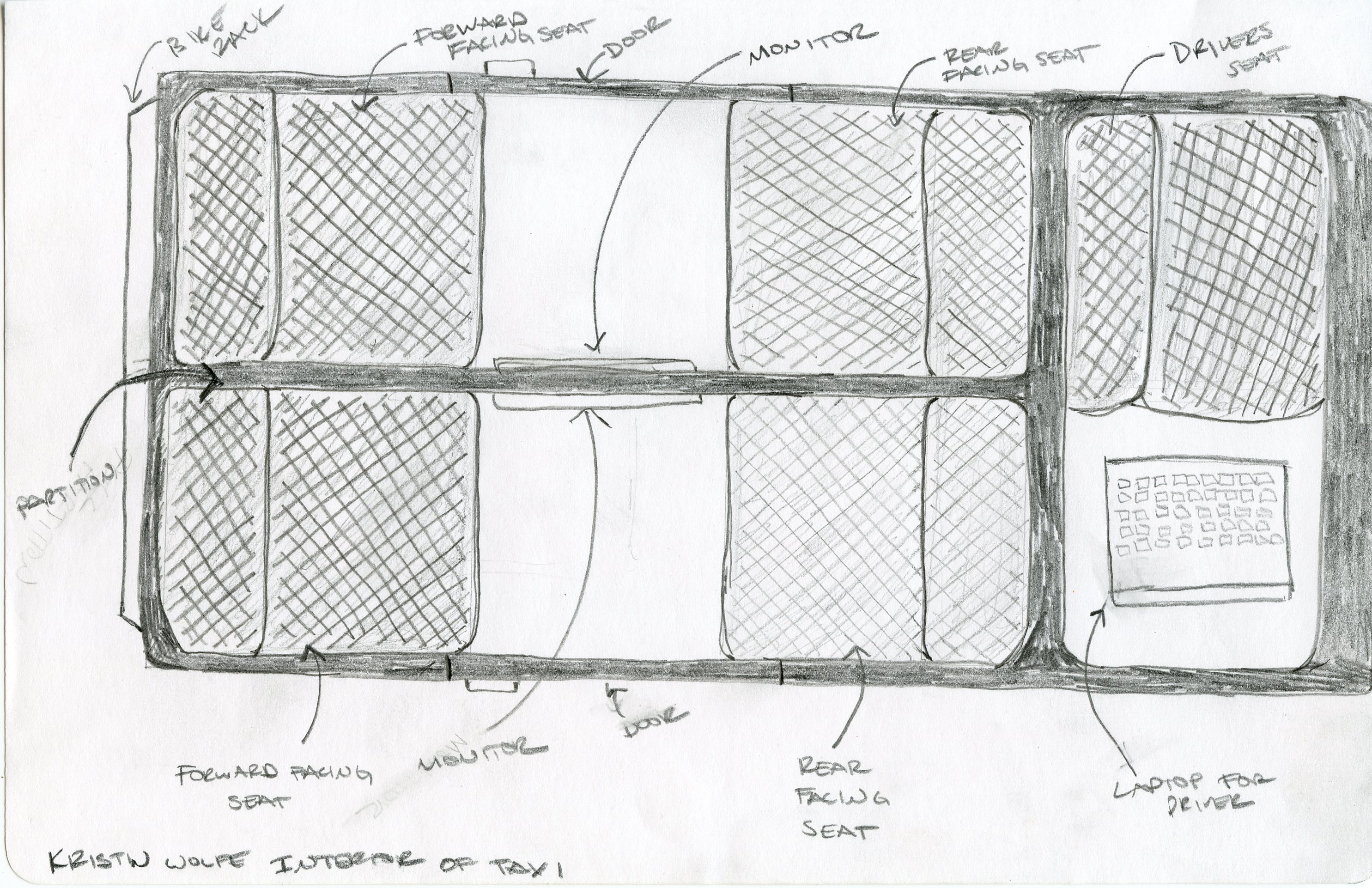
In order to be able to provide enough space for my proposed portioned design, I modeled my taxi after the Scion XB and the Smart Car. A boxy shape allows me to partition the passenger portion of the taxi down the middle while still preserving enough space so that four passengers would be comfortable. So that the length of the car did not border limousine status, I eliminated the trunk space and mimicked the rear end a Smart Car.

For materials, I am using carbon-fiber for the frame and polycarbonate resin for the exterior body panels and windows. These materials are very light weight and will increase fuel efficiency and subsequently the taxi would burn less fuel and require less energy. The resin is made out of recycled bottles and therefore is inexpensive, so replacing the panels would be affordable if they were damaged. Since the taxi suffers from a lot of wear and tear due to the frequency of passengers entering and exiting the vehicle, having readily available and inexpensive replacement panels would be a must.


            For the engine, I included a hybrid engine that is supplemented by solar power that is generated  from the panels located on the top of the vehicle. One of the main considerations I had for the shape of the vehicle was the ability to allow for the incorporation of solar panels.  The car would be programmed to first utilize solar power. If solar was not available, it would revert to battery power. If the battery power was drained, the car would then run off of gas.


Interior Design


One of the biggest redesign elements of the taxi is the split passenger space design. Splitting the space allows for the cab driver to be able to pick up two different passenger parties. The passenger seats face each other on their respective sides and allow for easy conversation if two people are riding together. The screen on the partition displays various information including; the navigation route, detailed breakdown of the taxi costs, and streaming TV for entertainment.

The interior materials that were selected are able to withstand a lot of abuse and allow for easy cleaning. For the seats, I used a fabric called NanoSphere that is made by a company called Schoeller. The fabric does not absorb fluids and requires minimal cleaning. If the fabric does get dirty, it requires a small amount of water and little effort to remove any dirt. For the floor, I choose a dark gray low profile carpet that was inexpensive, durable, and would hide dirt well.


Software Applications


            To enhance the modern design of the taxi, improve efficiency, and increase customer satisfaction, I included software applications for the taxi company and the customers. In the cab, the driver will have a laptop next to the driver’s seat. The laptop will provide GPS capabilities, alert the driver of where to pick up a customer, and track all of the fares that he/she has accrued on a given day. For the customer, an application will be available on a phone or on the web that hails a cab, confirms the route the customer wants to travel and notifies them when the cab is two minutes away so they can be ready to be picked up.


Benefits of the redesign


The redesign benefits both the taxi company and the customer. The taxi company has the ability to transport more customers because of the split passenger space and collect twice as many fares. The software applications allow for the dispatch personnel to more efficiently route drivers and reduce operating costs. Customer satisfaction is vastly improved because they now have the ability to plan for an exact cab arrival time, anticipate the costs of the ride, and ride in a comfortable fashion. 

ImageImageImageImageImageImage

Final Project Movie Poster – GIT 230

Image

The idea for my poster was mainly to poke fun at all of the Fast and Furious movies that have been created. I did a Google image search for all of the posters and picked to re-do with the Fast & Furious 6 theme.

Photoshop

I opened the existing poster in Photoshop. I deleted the existing car from the poster by using the magic wand tool and the magnetic lasso tool. I then used the polygonal lasso tool around the girl, copied the image, and created a layer for just her image. I then used the magic wand tool to delete any leftover background. I used the magnetic lasso tool to select the guy and created a layer with just his image. Next I copied a section of the clouds, pasted it, reflected it, the lined the copied image up to cover up where I deleted the pre-existing text.

I then used the clone stamp to fill the texture of the road that had been previously a car or person so I would have a clean slate to start re-designing the poster. I used the magnetic tool to copy part of the cement barrier, pasted the image, and transformed it so it looked like a continuation of the existing barrier.

I found the image of the Lincoln and opened it in a different window. I used the magnetic lasso tool to select the car out of the image and drag and dropped it into the poster file. I defringed the car and did a perspective transform.

I organized the layers so the girl was standing behind the car.  I scaled the man, and positioned him in a similar spot he was in the original poster. Part of his side was missing because the original car had the side mirror over him, so I again used the magnetic lasso tool to copy an image of the driver’s side mirror, pasted it in its own layer, and position it so it would be over the man’s image. I also defringed the man’s image.

Next I painted on the shadows on the ground for the car and on the side of the car where the man is leaning. I also them burned in portions of the road.

Illustrator

The type with the actors names at the top I created an original and then copied and pasted the type and adjusted the type with the different actors names; I used guidelines to make sure they were spaced the same. The line in black I adjusted the lines in different size for more of an impact and applied a white stroke.

For the Fast and Furious text, I adjusted the baselines of the “F”s so they would mimic the original poster type, turned the text into outlines, and did a perspective transform on them. I also turn the additional title text into outlines and added shadows to all of the text.

The type on the bottom of the poster, I typed out each line and adjusted the type sizes to look similar to the poster examples we were given.

Illustrator Board Design – GIT 230

Board Frames

I started by drawing the frame of the boards with 2 ellipses and a rounded rectangle between the ellipses. I added anchor points to the rectangle and then pinched in the center of the rectangle so the middle looked like a snowboard. I then used the shape creator tool to merge all of the shapes. I duplicated that shape to create the back of the board.

I downloaded a Kuler color palate (Theme 46) from the Adobe site that I liked.


Front of the Board

I used the line tool to create a line at a 45 degree angle. I then reflected and copied the line to make the top of the chevron pattern. Then I joined the 2 lines and reflected again. I transformed the lines until I liked the shape of the chevron. Once I had the base of the chevron pattern created, I duplicated it and lined them up down the board. I used the board as a clipping mask over the chevron pattern I created.

I downloaded a picture of Julius Jr. (a character on a Nick Jr. show that my son loves) and I used the selection tool in Photoshop to select only his face. I placed the monkey face into Illustrator and traced the image to make it a one color image with a stroke outlines. I then duplicated the monkey face and placed the image on the top and bottom of the board. The text on the front of the board I used a vertical type tool.


Back of the Board

I selected the entire board and applied a gradient. I used a radial gradient, applied the Kuler color scheme I downloaded, adjusted the position and radius of the gradient. On the type, I changed the baseline of the T and then turned the type into outlines. I applied a plastic wrap effect. I created the tree in illustrator by using the ellipse and rounded rectangle tool. I used the shape builder tool to merge parts of the ellipses in the top of the tree and then used live paint to bring out selected lines in the stroke. I then used the fish eye effect to distort the tree a little more. 

The colors look a bit different here than they do in Illustrator.

Image